Viva Gym
I took VivaGym’s mobile app as a case study to reimagine its core experience, reducing friction in booking classes and tracking activity, and laying the foundations to improve adoption of key features and weekly member engagement.

Problem Definition
The current VivaGym app shows usability and consistency issues that make it harder for members to find, plan and track their workouts. Navigation between classes, routines and progress is unclear, and there are few elements that support motivation or habit-building. As a result, the app underuses its potential as a daily companion and as a key channel between VivaGym and its members.
Value Proposition
This case study reimagines the VivaGym app as a clearer, more motivating digital coach that better aligns user needs and business goals. The redesign focuses on simplifying navigation in key sections, adding activity tracking and challenges, and introducing personalized training and nutrition plans. The aim is to support members in building consistent habits while strengthening retention and recurring app usage.
Objectives
Uncover UX Issues
Based on objective data from surveys and product observation, as well as comparison with industry benchmarks.
Design Improvements
Aimed at optimizing navigation, accessibility, and user motivation.
Research
Through surveys, usability analysis, heuristic analysis, observation, and understanding of how market leaders deal with these situations, the context and general issues to be addressed are defined.
User surveys
“How often do you use the app?”
Never (70%)
Almost never (20%)
Several times a week (10%)
“Which features do you use most often?”
None (80%)
Other (10%)
Nutrition plans and recipes (10%)
“The app motivates you to train more often?”
Nothing (80%)
A little (10%)
Some (10%)
Usability analysis
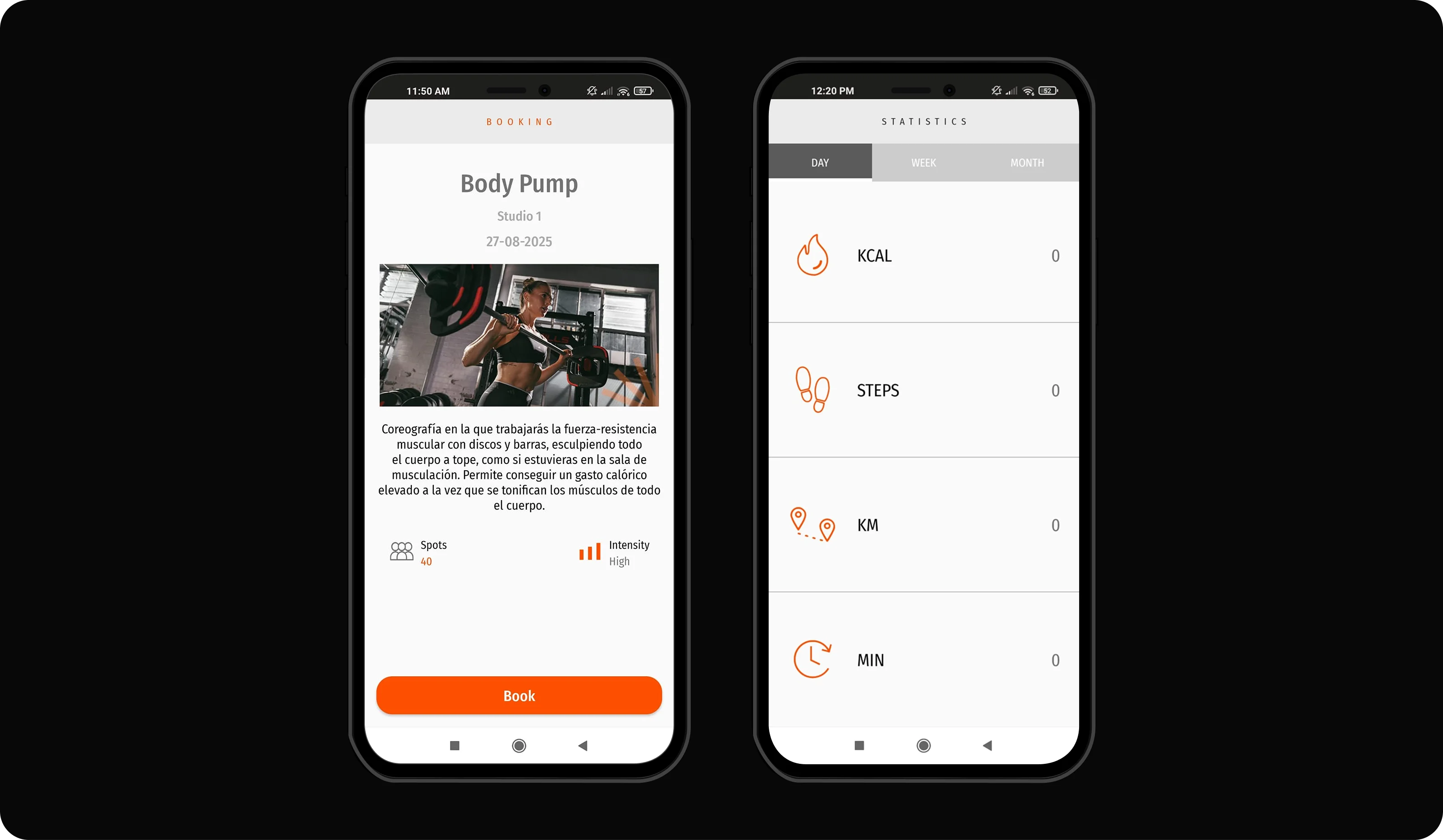
When booking classes, the process is simple, but feedback is limited and managing full classes is not intuitive. Personal information exists, but it is hidden and uninspiring.
Heuristic analysis
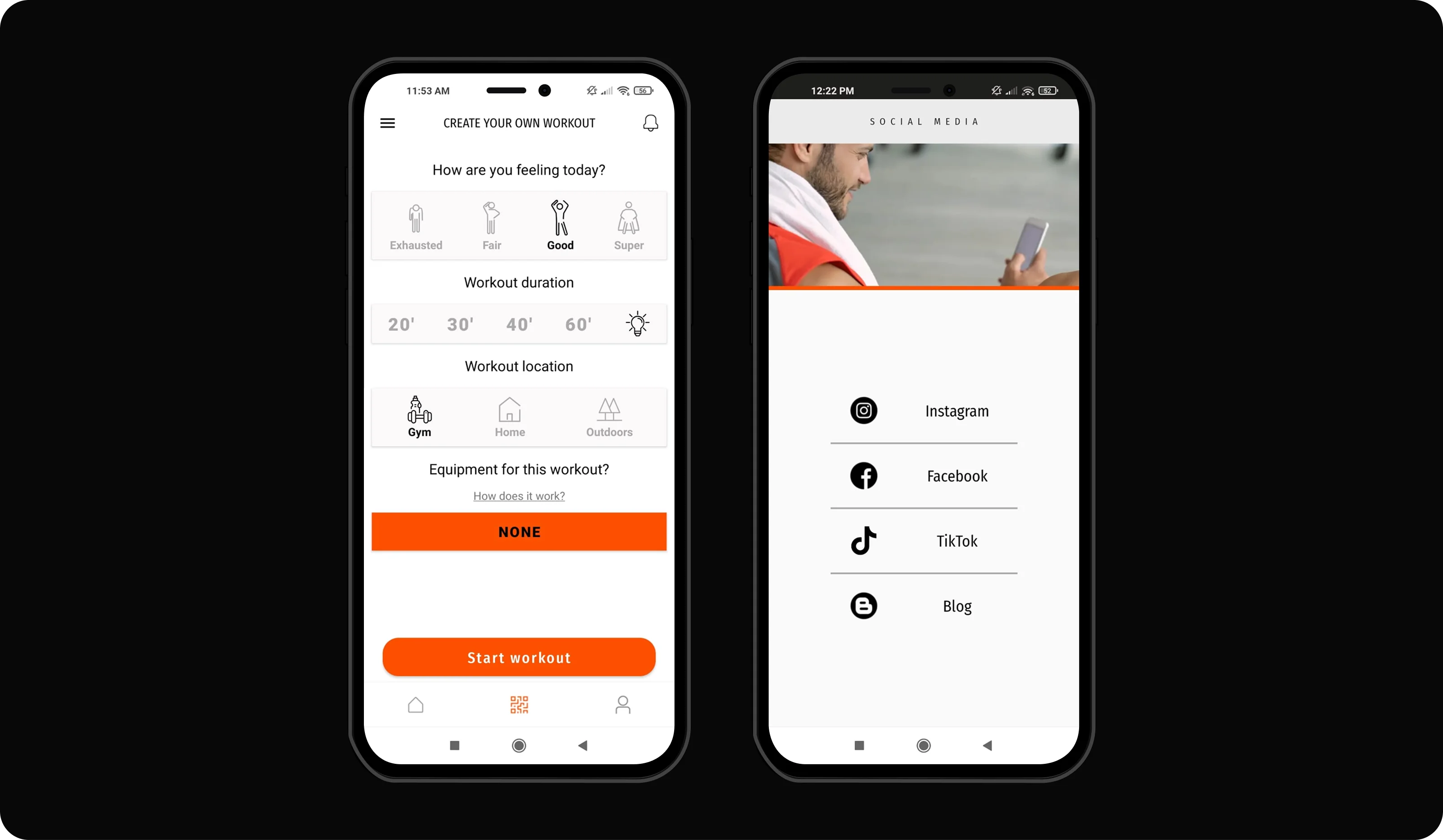
The state of the system suggests that feedback after actions is insufficient or unclear. In terms of consistency, there is a lack of visual coherence and usage patterns.
Market leaders

Strava offers personalized plans and progress tracking with an attractive visual experience. Duolingo keeps users active with streaks, badges, and visible rewards.
Design Decisions
Redesign Key Sections
The main screen is reorganized to clearly display quick access, recommendations, and user status.
Business impact
Improves usability and increases interaction with key services.
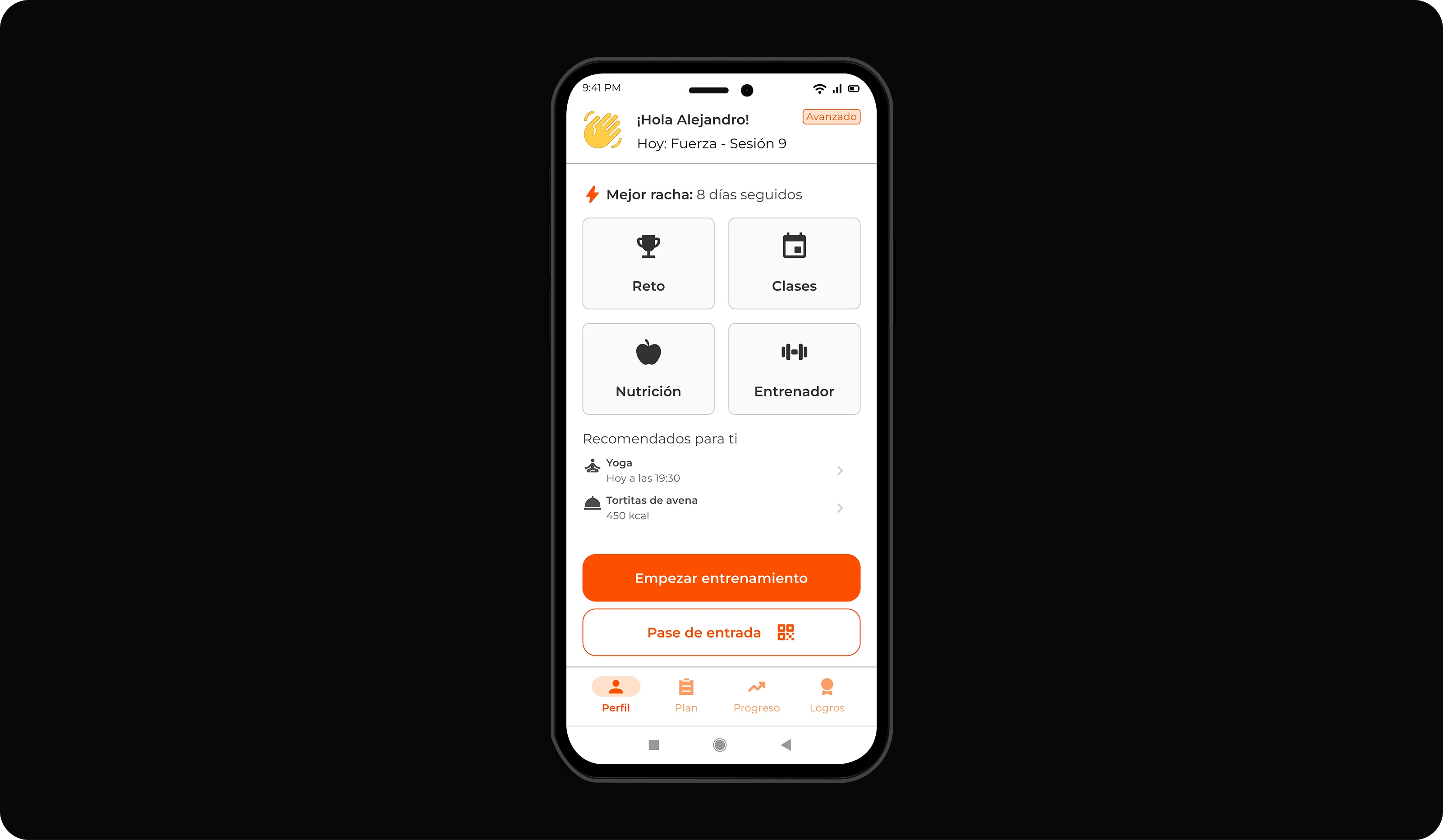
Activity Tracking
A system for recording and viewing daily and weekly progress is incorporated.
Business impact
Promotes retention and recurring use of the app.
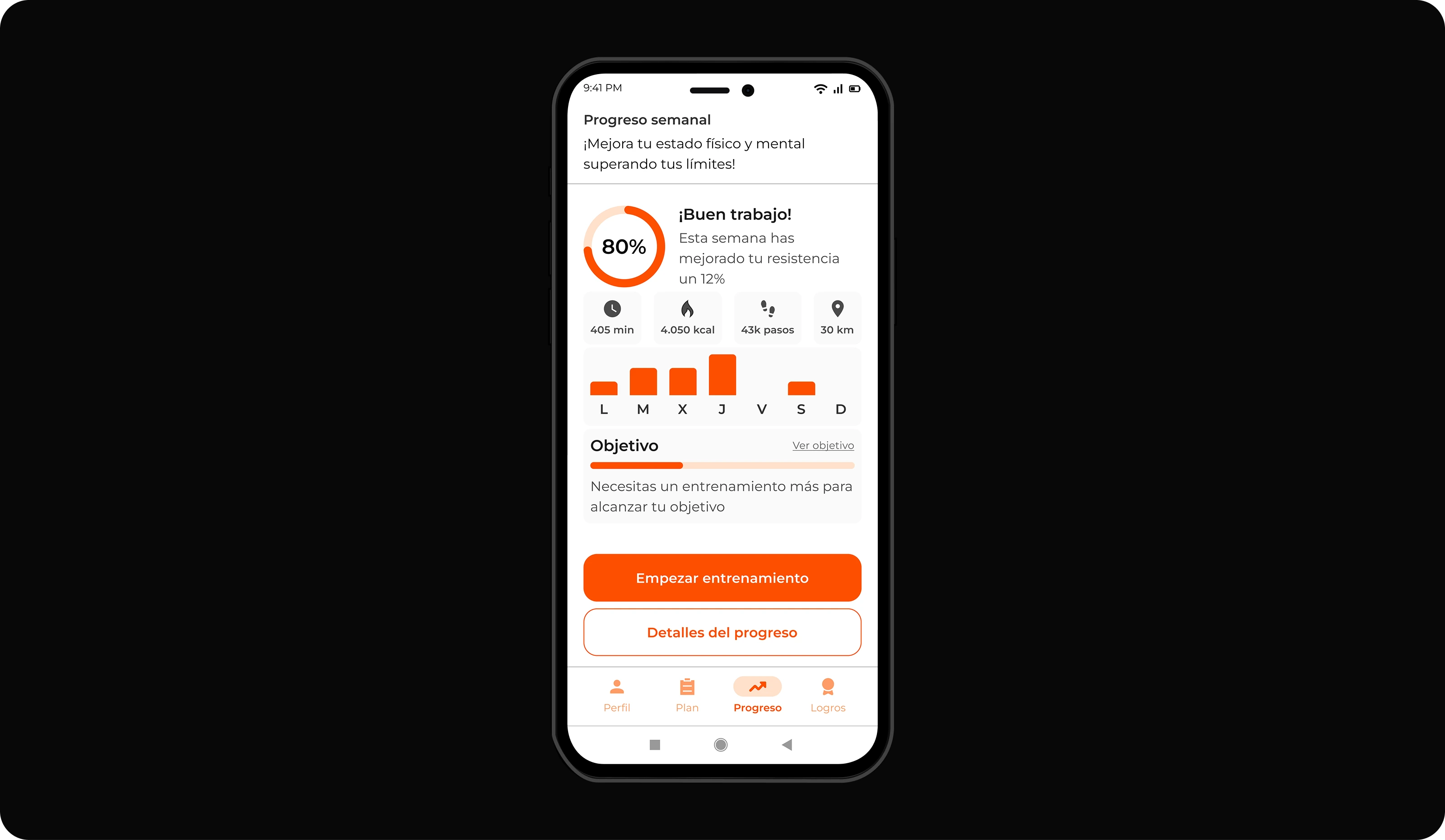
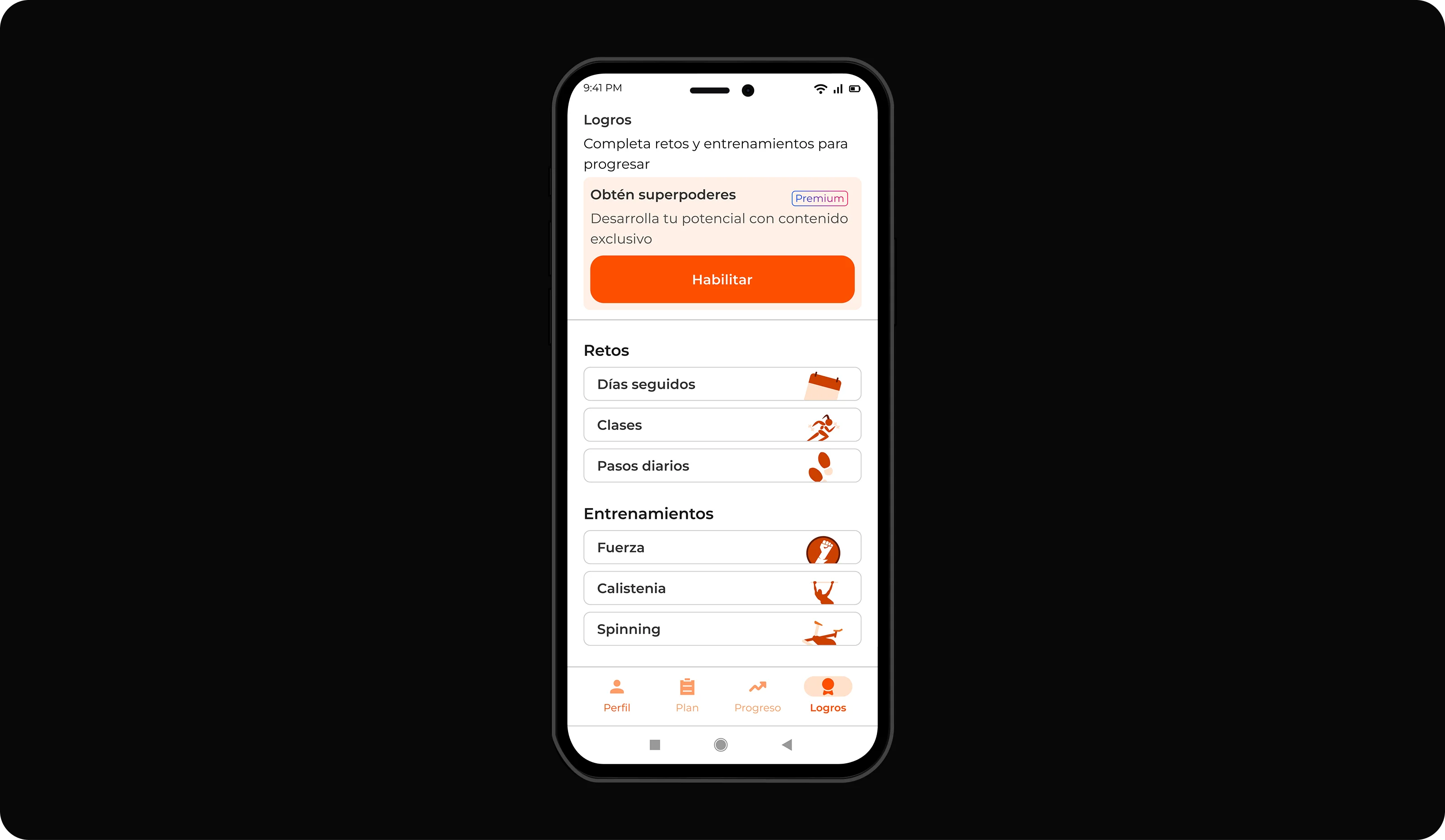
Motivational Elements
Personalized achievements, challenges, and reminders are integrated to encourage consistency.
Business impact
Increases retention and fosters social engagement.
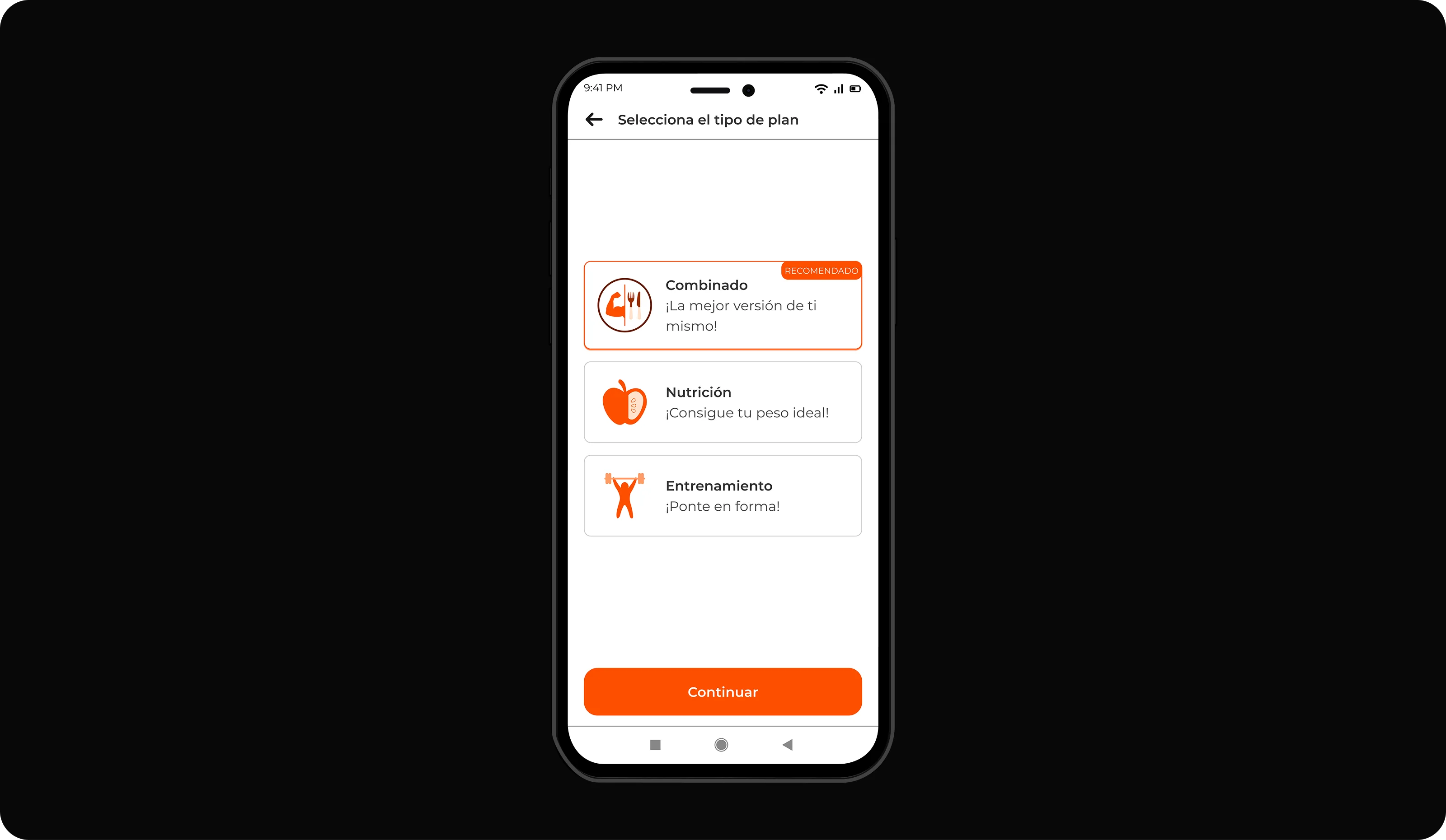
Personalized Plans
Training and nutrition plans are designed to suit the user's profile and goals.
Business impact
Generates tangible value, loyalty, and higher conversion rates.
Design System
Typography
Your progress is no coincidence. That session on Thursday was what made the difference. It's your day to shine!
Your progress is no coincidence. That session on Thursday was what made the difference. It's your day to shine!
Your progress is no coincidence. That session on Thursday was what made the difference. It's your day to shine!
Your progress is no coincidence. That session on Thursday was what made the difference. It's your day to shine!
Your progress is no coincidence. That session on Thursday was what made the difference. It's your day to shine!
Your progress is no coincidence. That session on Thursday was what made the difference. It's your day to shine!
Color
primary-100
#FFE1CC
primary-200
#FF9C66
primary-300
#FD5000
primary-400
#CC4000
primary-500
#992F00
primary-600
#661F00
Icons
Components

Impact
Member engagement ↑
Clearer navigation, visible activity tracking and in-app challenges make it easier to find value in the app, increasing weekly active members and session frequency.
Training adherence & retention ↑
Personalised plans and progress feedback keep members motivated to follow their routines, improving goal completion and reducing membership churn.
Learnings
Flows before visuals
Research showed the main friction was understanding what to do and how to complete key tasks, not the look & feel. This led me to focus first on information architecture and core user flows before refining visual details.
Motivation beyond gamification
Users were more motivated by seeing progress and following realistic plans than by badges or points. I designed challenges, tracking and personalised plans as habit-support tools rather than pure “gamification”.
Design system as a speed multiplier
Defining typography, icons and core components early created a consistent foundation. This made screen iterations faster and easier to scale to other sections of the app.